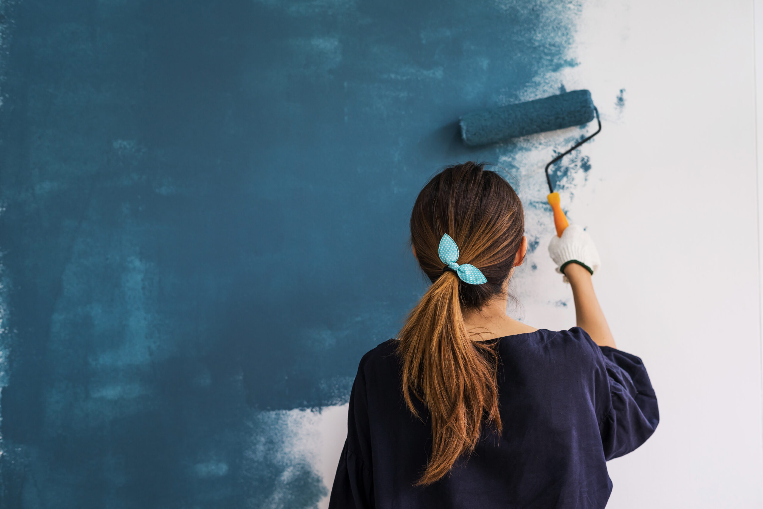
We all know with a new coat of paint on the walls, a room can be transformed quickly and economically but what colour to choose? Luckily this is the time of year when the paint companies release their new annual colours for the next season. In this article we will look at what colours are hot for 2020 from each of the paint suppliers.

Dulux
Dulux recently announced their colour of the year for 2020 as Tranquil Dawn and this was released along with 4 complimentary colour palettes; A Home for Play, a Home for Meaning, a Home for Creativity and a Home for Care. Tranquil Dawn is a grey based green and was chosen by a panel of fashion and colour experts to give homes a human touch at a time when technology is making us feel increasingly disconnected from each other.
Farrow and Ball
Farrow and Ball don’t tend to focus on one colour alone as their focal point. What they have done for 2020 is collaborate with the Natural History Museum to create a palette with 16 colours designed to capture the true colours of the world around us. These colours were inspired by shades found in a rare archive book owned by the Natural History Museum and covers pretty much every colour you could think of from whites to greens to grey and blues and purples.
Valspar
Valspar, according to Housebeautiful.com, have also taken inspiration from the natural world and its calming influence. As such the colour range is soft and calming with soft greens to peachy pinks. The range is made up of 12 colours with imaginative names such as Winter calm, a colour with subtle touches of lavender and Grey Brook which is a soft blue.
Johnstone’s
Johnstone’s take a similar approach to Dulux and release a single colour as its chosen colour of the year along with 3 complimentary colour palettes; In The Know, At The Core and On The Move. For 2020 they have chosen Chinese Porcelain as the colour of the year. This shade is described as a blend of Cobalt and moody ink blue and is designed to allow you to escape from today’s technology driven society in a calm environment which is very conducive for sleep.
Crown
According to Good housekeeping Crown have also recently revealed their top colours for 2020. These are based around 3 trends: Direct, Rethink and Connect. Direct is inspired by abstract expressionism and contains bright colours which are uplifting and energetic such as sky blues and bold plums. Rethink was inspired by composite materials made from recycled waste and brings together washed tones such as the soft green “revival”. Connect, the final trend, is based, like some of the other companies, on nature and helping us to disconnect from technology and connect with nature. A favourite in this latter trend being soft lime, inspired by the Japanese philosophy of forest bathing.
Graham and Brown
Graham and Brown are a lesser known paint supplier and they typically match their paint offerings to their wallpaper offerings. To complement their Bloomsbury design of wallpaper, they have chosen a deep bottle green named Adeline which picks out the leaves from the wallpaper and partners well with the neo mint of the wallpaper’s background.
Craig and Rose
Craig and Rose are another lesser known paint supplier and they are adding another 11 colours to their 1829 colour palette according to Melanie Lissack Interiors. The 1829 colours are chosen from Craig and Rose’s vintage colour archive as well as other historical sources to reflect on the past but with a view to the future. The 11 new colours include Troubadour which is an intense orange red to Reverie which is a pastel shade meant to reflect the sky just before sunrise.
As you can see a lot of companies are taking inspiration from nature to give us a sense of being reconnected to our planet rather than being swept up in the technological mire that is modern life. With so many wonderful colours available the world is your oyster when it comes to transforming your home and creating a relaxing and warm space.


